There is a reciprocal relationship between humans and color. Sometimes it shapes us––influencing mood, emotion and behavior. And sometimes we shape it––attaching meaning, symbolism, prestige and significance to certain colors. Cultural and global paradigms also shape the colors that fall in and out of trend and which most accurately represent our story at that time, as seen with the “Color of the Year” selections put out by the likes of Pantone, Sherwin-Williams and others.
Indeed, color is a powerful thing. In fact, it’s one of the most powerful visual communication tools. Many believe color to be its own language because it can convey a message, spark an action, and prompt physiological responses.
But what draws us to certain colors and repels us from others? And how can we use the language of color in art and design to effectively communicate a message, create a certain ambiance or mood, or express a story?
To understand this, let’s look at the color of the year (often referred to as COTY).
Color: A Sign of the Times
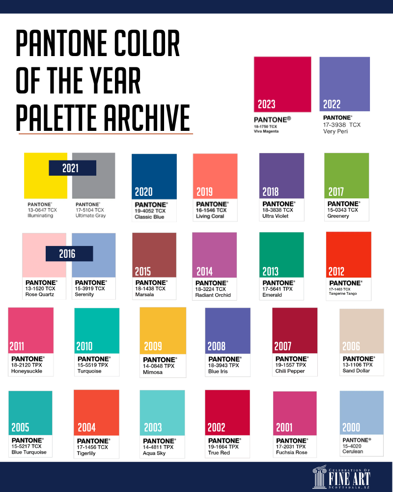
There is a strong connection between culture and color––what’s happening in the world around us is often reflected or expressed through color. It becomes another language––one that is often universally understood. Recognizing this phenomenon is what kickstarted the Pantone Color of the Year (COTY) educational program in 1999. Their goal was to show “…how what is taking place in our global culture is expressed and reflected through the language of color.”
For more than two decades, Pantone has released a color of the year that they believe is “symbolic of the age we live in.” It’s meant to serve as an expression and mood of the global society, and they base their selection on extensive, year-long research.
Similarly, Sherwin-Williams also began releasing its Colormix Color Forecast and color of the year, both of which aim to reflect what is going on in the world around us and support what the global society is needing or craving. While the COTY and color forecast do inherently bring certain colors into trend, the goal is really to identify colors that are symbolic of what is happening.
This year, that seems to be calling to nature and joy.
While Pantone’s COTY leans more bold and Sherwin-Williams is all about warmth and comfort, there are three overarching themes that carry through both color palettes: nature, connection and joy.
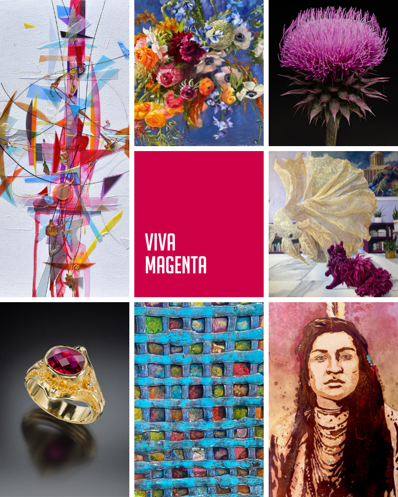
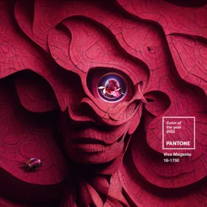
Pantone’s COTY is Viva Magenta 18-1750. As the company describes it, it’s “a shade rooted in nature descending from the red family and expressive of a new signal of strength.” Viva Magenta is meant to symbolize bravery and fearlessness, joy, optimism and starting anew.
Sherwin-Williams named Redend Point SW 9081 its COTY for 2023. This color is inspired by connection, care, warmth and soul. Redend Point is one of 40 colors that make up their 2023 Colormix Forecast named Terra, which is comprised of four different palettes:
- Lore –– this palette symbolizes passionate creativity and inspiration.
- Biome –– these colors represent balance with the ecosystem.
- Nexus –– this palette represents grounding, serenity, well-being and warmth.
- Origin –– these colors symbolize joy, free-spiritedness, nostalgia and vibrancy.

While COTY selections may not always resonate with everyone, they serve an important purpose: to show that color can be used as a form of self expression and communication, and as a tool for stimulating certain moods and behaviors. With that in mind, how do you effectively use color throughout your interior design and art selection?
Color: A Tool for Storytelling
First and foremost, we always advocate for selecting art you love. If a piece calls to you, don’t be concerned with whether or not it will match your sofa or overall color scheme. More often than not, it is possible to fit art into an existing color scheme by picking up hints or notes of your color palette in the piece, especially if you use the 60-30-10 rule.
This is a common ratio used by designers in which 60% of a space is filled with one dominant color, 30% with a secondary color, and the remaining 10% with an accent color. The dominant color might appear on walls with paint or wallpaper, large-scale furnishings, and area rugs and other flooring. The secondary color can be picked up in other pieces of furniture, accent pieces, textiles, lighting, etc. The remaining 10% is the fun part. This is your opportunity to experiment with color families, textures and patterns –– perhaps mixing natural wood or stone with metallics or adding a few bold statement pieces (like a piece of art).
When choosing a color palette, start with what resonates with you––just as you would with selecting a piece of art. If you’re not sure, some like to base color decisions on the meaning or feeling associated with each color:
- Red: Ambition, love, passion, anger, activity/stimulation
- Orange: Energy, optimism, vitality, charisma
- Yellow: Happiness, joy, fun, spontaneity, friendliness
- Green: Growth, prosperity, abundance, new beginnings, healing, freshness
- Blue: Calmness, intelligence, authority, loyalty, responsibility, security
- Purple: Creativity, mystery, distinguished/royalty, compassion, devoted
Keep in mind, the value (lightness or darkness) of a color can enhance or subdue its effects. Additionally, while not considered strictly colors, black and white can also impact the feel of a space. Black can add drama, moodiness, elegance, confidence and mysteriousness to space where white will brighten and evoke a sense of purity, innocence, influence, honesty, etc.
Whether you’re looking to make a statement, tell a story or simply achieve some color therapy in your space, consider these common characteristics, but don’t ignore how each color makes you feel. We each bring our own set of experiences, biases and lenses (literally) to the color equation and that impacts how we interpret them.
Finally, here are a few other quick tips to keep in mind when selecting a color palette or integrating artwork into your scheme:
- Light will change the appearance of a color. Consider if your space has a lot of natural daylight and the type of artificial light used––warm, soft light vs. cooler bright light.
- Texture will also impact the appearance of a color. Smooth surfaces tend to be a more true representation of a color where rougher surfaces can appear darker due to the shadows created by the scattering of light.
- Size matters. Smaller objects may appear darker and more dull than larger objects of the same color.
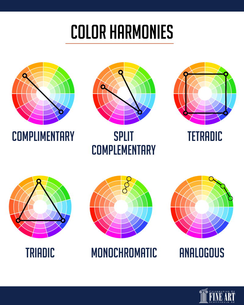
- Artwork can inspire the overall color composition of a space or add to an existing one. When tying it into your space, consider color harmonies of color theory. A few include:
- Monochromatic –– the use of one color and its various values
- Analogous –– the use of colors that neighbor one another on the color wheel
- Complementary –– the use of two hues that are opposite one another on the color wheel
- Split complementary –– a trio of colors comprised of two neighboring hues and one directly opposite the two on the color wheel
- Triadic –– the use of three colors that are equidistant from each other on the color wheel
- Tetradic or double complementary –– the use of two pairs of complementary colors
Characteristics of a piece of art can be carried throughout a space through color, pattern and even texture. This might be through the use of patterned throw pillows, accent colors in floor coverings, or even other pieces of artwork. In other cases, the artwork can also serve as the statement piece and possibly stand out from the overall color dominating the space.
Finally, keep in mind, just as color is a powerful visual communicator, so too is artwork. So even if it doesn’t fit in with the color scheme, pattern or texture, if it adds to the overall story, message or feeling you are aiming to achieve within the space, it won’t feel out of place.